|
|
Post by undergroundruin on Sept 21, 2010 19:53:58 GMT -5
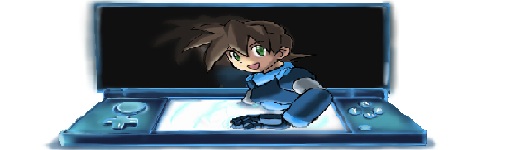
I've been looking around, playing a few games here and there, and I was wondering what most people would consider a fitting artstyle for a official Megaman Legends game. Sure it'll probably never be made, but I thought this could be a interesting subject.
|
|
|
|
Post by SIMSteven on Sept 21, 2010 20:50:00 GMT -5
Anime cartoon. That's really what the games were made to look like.
I really doubt some of those hairstyles would work with anything else, really.
|
|
|
|
Post by undergroundruin on Sept 23, 2010 19:49:15 GMT -5
Well there are a lot of different looking anime styles out there. Im just thinking if there is a new game (with the better graphics etc) its going to look somewhat different than what we have seen in the past 2 games. Somewhat like we saw between Legends 1 and 2, but maybe even more different because of the 10+ year gap. I was thinking maybe something like this: image.wetpaint.com/image/1/gXmBhNyfFmrFjUBbwynbyw471197Or maybe this: image.wetpaint.com/image/1/Q7OPhtn-p6wMsgEuP-ObXw1156765Id rather see their own style, and have it as close to the other games as possible. I just thought it might be interesting to talk about something like this. |
|
Exo
Bureaucratic Unit

Posts: 74
|
Post by Exo on Sept 23, 2010 23:37:23 GMT -5
The characters in both of those pictures seem kind of emotionless in my opinion. I think the art style used in Welcome to the N.H.K might work better. |
|
|
|
Post by Cere on Sept 24, 2010 9:07:46 GMT -5
So I'll answer UGR's question first. I agree with Sim that MML has to be anime, specifically with slightly deformed characters with a touch of moe (e.g. K-On), and vibrantly coloured backgrounds (e.g. the Ef animes) that are more detailed in comparison to the characters themselves. In addition, because MML is an action game, realistic physics is important and movement should be reflected in the backgrounds. By this, I don't mean action lines (not sure what they're called) to represent movement like what you often see in Pokemon. Haha, I think I expect too much when I wish for cinema-level production quality and competent direction.
Even though it contradicts everything I just described, I wouldn't mind either if MML turned into something like One Piece and used classic 90s visual elements.
What I can't stand though is if MML adopted a more serious style featuring realistic body proportions, a darker style like Hellsing, or highly idealized design like the recent Final Fantasy games. A little more about characters since I see people draw MML in this style often. The typical shounen style, such as Bleach, doesn't work for MML for similar reasons already stated above. (Edit: To put it a little more vividly and crudely, MML doesn't need big boobs.)
More than any other Megaman series in my opinion, the MML technology share an important visual design, the "Lego look." The machines in MML, especially the Carbon inventions (however anamorphic they appear at times) resemble machines. This is achieved by exposed or familiar components found in real life machines. We sometimes even find the same components on their body armour. What I think this shows is the effect of culture on their styles.
|
|
|
|
Post by SIMSteven on Sept 24, 2010 10:23:15 GMT -5
One art style that I also don't think will work will be manga-style, found in Musashi Samurai Legend. Skip to about 30 seconds in. A short descrption is cell shading with a heavy outline. I think we know how it didn't quite work out so well in MM X7/X8. |
|
|
|
Post by Servbot42 on Sept 24, 2010 11:17:03 GMT -5
This thread is really confusing to me. All of these art styles seem to deviate from the original, which could just be made more sleek and polished with current generation graphics.
Like, you know, this:
Look at Tron, or the Bonne level in the background. That seems to be pretty loyal to the art style of the PS1 games. I don't see why MML should adopt an art style similar to some anime since that would take away the original style that the series already had. That's basically what is causing my confusion: Why take away the style that made MML what it was and replace it with some other art style?
|
|
|
|
Post by undergroundruin on Sept 24, 2010 13:39:58 GMT -5
@servbot42 While you may not understand the whole point in the thread, what you said is exactly what I am looking for. (your opinion) One of the reasons I brought this up is because from MML1 to MML2 the style to me looks a bit different because of the polishing process done to MML2. I liked MML2s style a lot better. If they did it like the MvC3 style we see Tron with I would be more than satisfied. To me though the style we see Tron in in MvC3 is slightly different (because of the limitations of PS1) than MML1 and MML2. I just think that art styles can be polished in different ways. And there are animes out there that look similar to the Legends art style. Part of this discussion is what people think is close to the MML art style. One of the reasons I brought this up was because the 2 pics I posted are of games I was thinking of ripping models from to make a fangame of MML. Exo Its the style I was really referring to, and in a game when your doing nothing there are usually no emotes happening. Cere I agree with you in part. I dont really like One Pieces art style. @sim I agree totally. |
|
|
|
Post by Cere on Sept 24, 2010 14:09:22 GMT -5
Aha! I suspected you asked because you're contemplating a fan project.
I agree with UGR that the MML style can be polished differently. Something that bugs me about the recent cameos in fighting games is the "rounding-out" of their faces. Perhaps round faces reflect the age of the characters better, and round faces indicate friendliness, but I like the more angular faces found in the original games better.
Something else that bother me in Servbot42's video are the colours, comic-tone, and shading on Tron's character model. Presumably, it was done to make her fit in better with the rest of the combatants who are predominately from Western comic books. The "comic style" is particularly noticeable in the first 12 seconds during the opening. They really overdid the comic style shading on the Gustaff when they filled whole sections with blotches of black ink.
|
|
|
|
Post by SIMSteven on Sept 24, 2010 18:18:33 GMT -5
If you're concerned about art styles, I don't have as much to worry about in terms of anime vs western art.
The main reason I say this is that Capcom makes video games for a living, not Marvel. The movie scene in the first 12 seconds simply had more prerendering done to it so it looked different.
|
|
Exo
Bureaucratic Unit
Posts: 74
|
Post by Exo on Sept 24, 2010 19:56:37 GMT -5
I have to agree with UGR about the one-piece style...
I highly doubt Capcom will disappoint as far as art goes. I'm much more worried about the VA's however.
|
|